
Analyzing Album Covers:
A GRAPHIC DESIGNER’S PERSPECTIVE
Thought it might be fun to have a casual blog… So why not?
When you become a graphic designer, you start seeing everything a little differently. Every piece of digital or physical media becomes something to take inspiration from or to critique.
Graphic design is almost everywhere you look, including in MUSIC. So today, I want to take a moment to analyze the graphic design included in music - more specifically, in album covers:
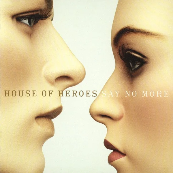
SAY NO MORE - HOUSE OF HEROES
To start off, I want to talk about Say No More by House of Heroes’ album cover.
Conceptually, this album cover is both strange and beautiful. The faces seem artificial. It is as if the people themselves have emotion in them, but their faces are incapable of showing it.
The design fills the space and makes it feel balanced even though the woman’s face actually fills up more of the space than the man’s. The empty space in the background ALSO makes it clear what the focus of the cover is.
The choice to make the text cross over from the man’s face and change color on the woman’s face was an interesting one. It brings more contrast to the design, but the text on the woman’s face - the actual album name - is a bit difficult to read.
As a designer, I wouldn’t have done this the same way, but as a consumer, I’m not sure I would change it. This album cover is intriguing and captivating.
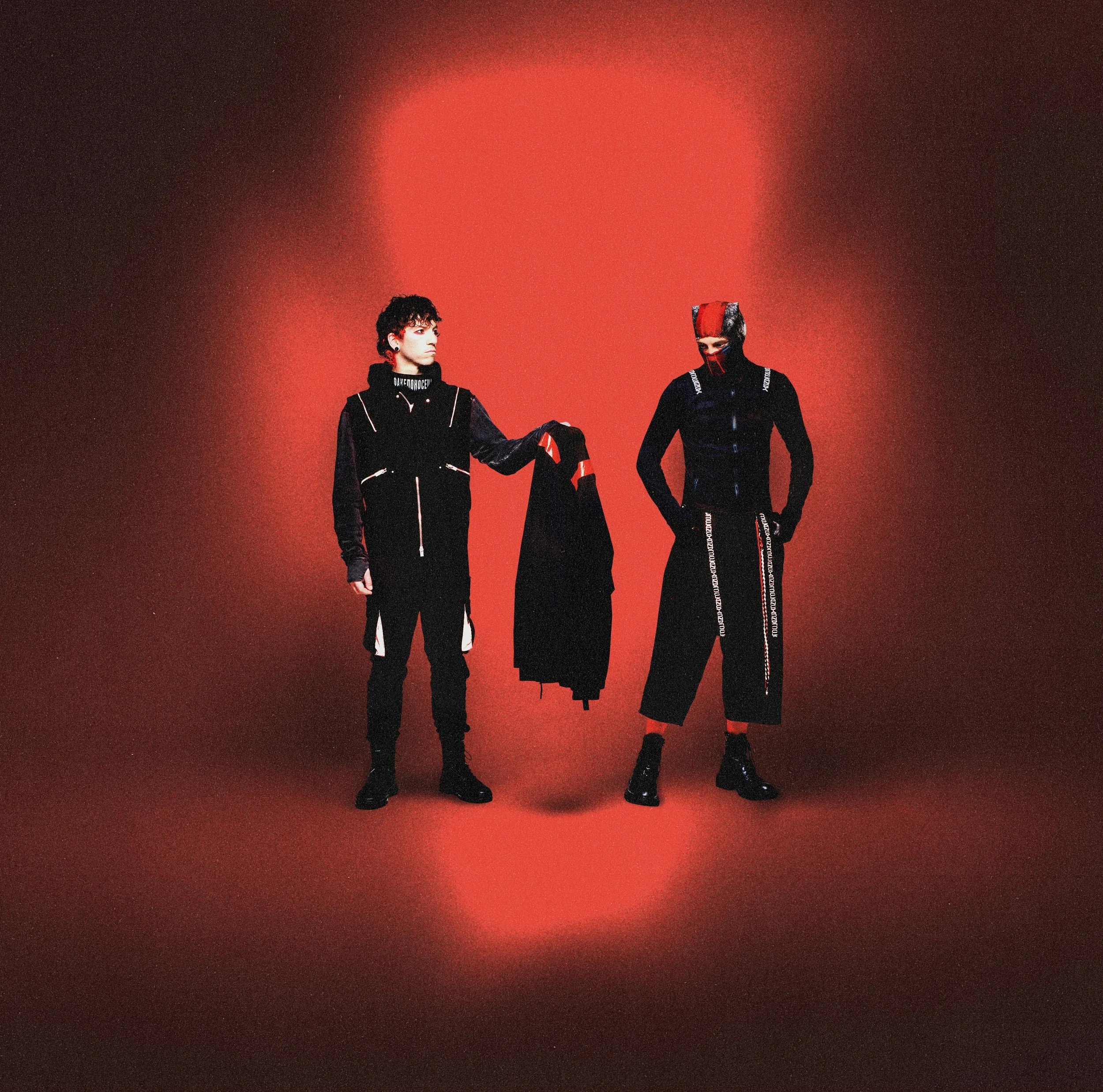
BREACH - TWENTY ONE PILOTS
The album, Say No More, is actually 20 years old now. Breach, on the other hand, came out last year and has a much more modern feel to it.
The dark, duo-tone colors are very in-style right now. The color red is very central to the band and to this album specifically, and it makes this cover stand out among those from other bands.
The album cover is mostly dark, but the light in the center is bright enough for the two band members to wear black and still stand out.
One of my favorite things about this album cover is the shape of the light. At first, I thought it was a strange choice because I would have expected the light to look like a circle.
Eventually, someone pointed out to me that the shape of the light with the two band members and the jacket in the middle actually creates a skull shape. Skulls are very central to the symbolism of the band.
I almost didn’t believe it was a skull at first, but as soon as I really saw it, I couldn’t unsee it. The way the album cover manages to throw in this detail but leave it so ambiguous that the viewer is continuously fascinated by it, is impressive.
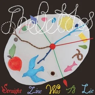
THE STRAIGHT LINE WAS A LIE - THE BETHS
This is just about the strangest album cover I have ever seen. It is playful and childish in its color scheme, and the clock appears to be a craft a kid might have made in school.
Part of me likes this album cover for its quirkiness, but at the same time, I strongly dislike the fonts, and the white text on the white clock makes it difficult to read the name of the band.
I like the fact that every word on the bottom of the cover is a different color. As I mentioned before, duotone designs are commonplace right now, and choosing to incorporate color in this way was actually a good way to stand out.
Unfortunately, this album cover usually turns me off the album overall. I enjoy the songs on it, but when I see the cover pop up on Spotify, I see a strange, chaotic design, and that naturally, affects how I think of the music.
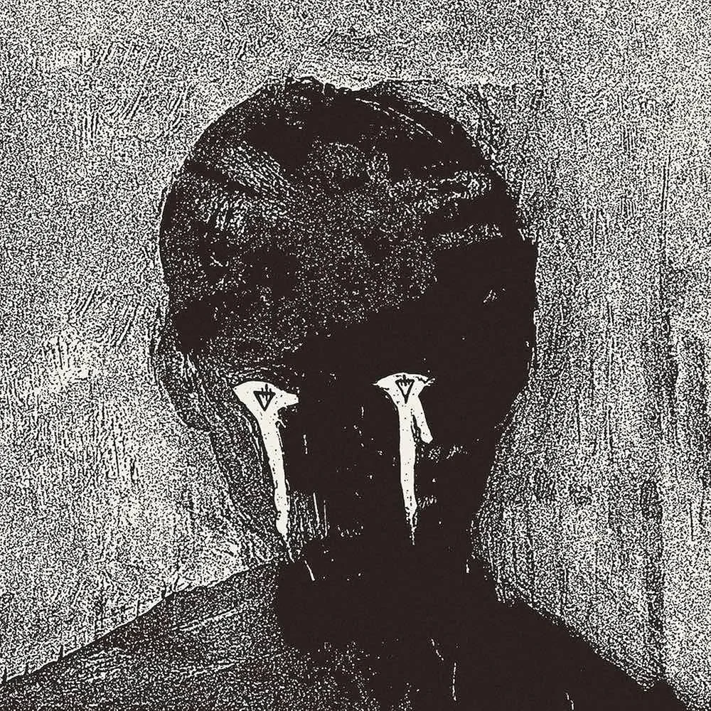
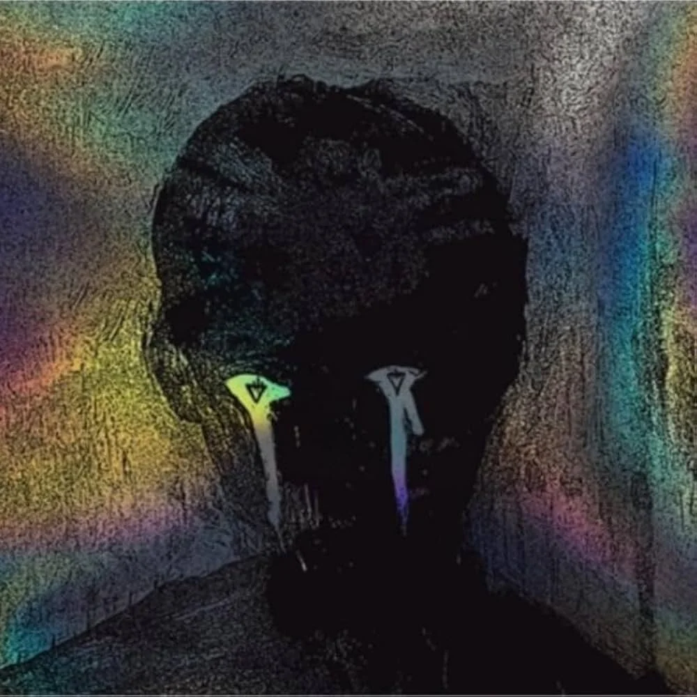
COLOR DECAY - THE DEVIL WEARS PRADA
Lastly, I wanted to talk about something very MadeofColor-esque. Above, is the album, Color Decay, by The Devil Wears Prada.
The original album cover is on the left and is in all black and white. It is a very plain cover of a man crying. The man is only a silhouette, but his eyes and tears are white. This makes the tears stand out as the main point of the image.
After the album was released, a deluxe edition was also released, and this cover is in all different colors, filling in the background and tears of the man. The colors are still a bit faded, but it works in concept with the album as its name is Color Decay.
In my branding, I love working in both black and white and in many colors at once. These album covers do the same thing.
From a design perspective, I might argue that the album cover does feel a bit unbalanced because of the positioning of the eyes on the cover. If the eyes were raised, it might not feel that way.
Then again, I think the reason the eyes are lower might be because the man is looking down, which makes sense because he is crying.
Besides that small issue, I Iove this album design, especially when I can put it beside the design for the deluxe edition!
I love looking at album covers because they are a meeting place between two of my favorite things - music and design. The albums I chose for this article are from some of my favorite artists.
Seeing the thought they put into, not only their music in itself, but the way they marketed it, is exciting for me as a graphic designer!
From the object of every design to the colors and fonts in them, album covers are how a band represents themselves and the sound of their music. In that way, you can learn a little about every band represented here, just by their album covers - just by their graphic design!
Made of Color can help you develop YOUR brand and tell people about who YOU are.
Fill out the form on our home page or send an email to get Made of Color’s help on your next project!